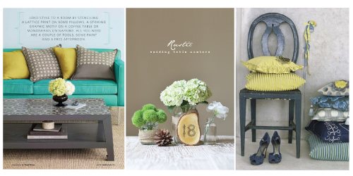
Now that we have a name settled on we had to create our brand. This for me was the hardest part, being a designer I tend to put a lot of pressure on myself. We wanted the brand to reflect a look and feel I termed “industrial organic”. To me this term invoked modern design with bold crisp colors paired with neutral earthy tones. We wanted to make sure our brand incorporates our design aesthetic which is the fusion of modern + vintage with hand drawn elements. The term “industrial” represents the bold, crisp color palette paired with simple and clean designs. The term “organic” represents earthy colors and textured elements woods, cotton, canvas, burlap, organic brick. When you fuse the two together you get a bold, clean and simple design.
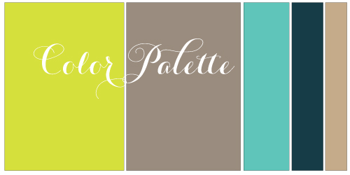
I have been gathering images on my pinterest account for months and these three images really spoke to us. I finally narrowed down the color palette of navy, taupe, chartreuse, and turquoise. After continuing to play around, I have settled in with taupe / steel color paired with chartreuse as our main colors and then utilizing white, navy and turquoise as our secondary colors.


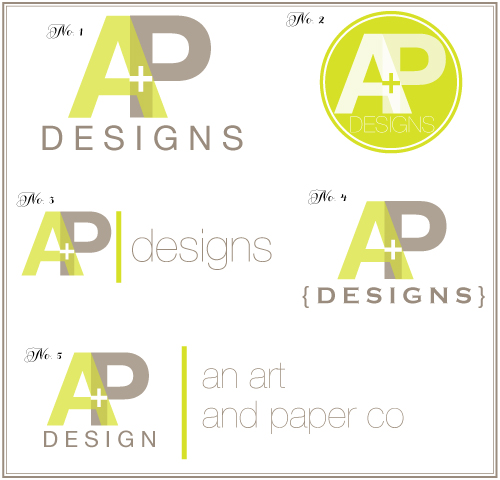
When designing the logo, Pat came up with the idea of fusing the A + P together since essentially that is what we are doing with the brand – a fusion of art + paper, alicia + pat, printing + design.

Now to decide… I am having a hard time deciding on which I like best. What do you think?

I like no. 2 because of the organic circle, but it doesn’t have the beautiful taupe.
So I think I would choose no. 3 because of the taupe and the modern lowercase “designs”.
PS.: this color palette is sooo chic!!
Thank you so much for your feedback!! I am definitely thinking #2 for the one color logo.
Congrats on all the amazing stuff happening! Love. It. I like number 3!
I love number 3!!